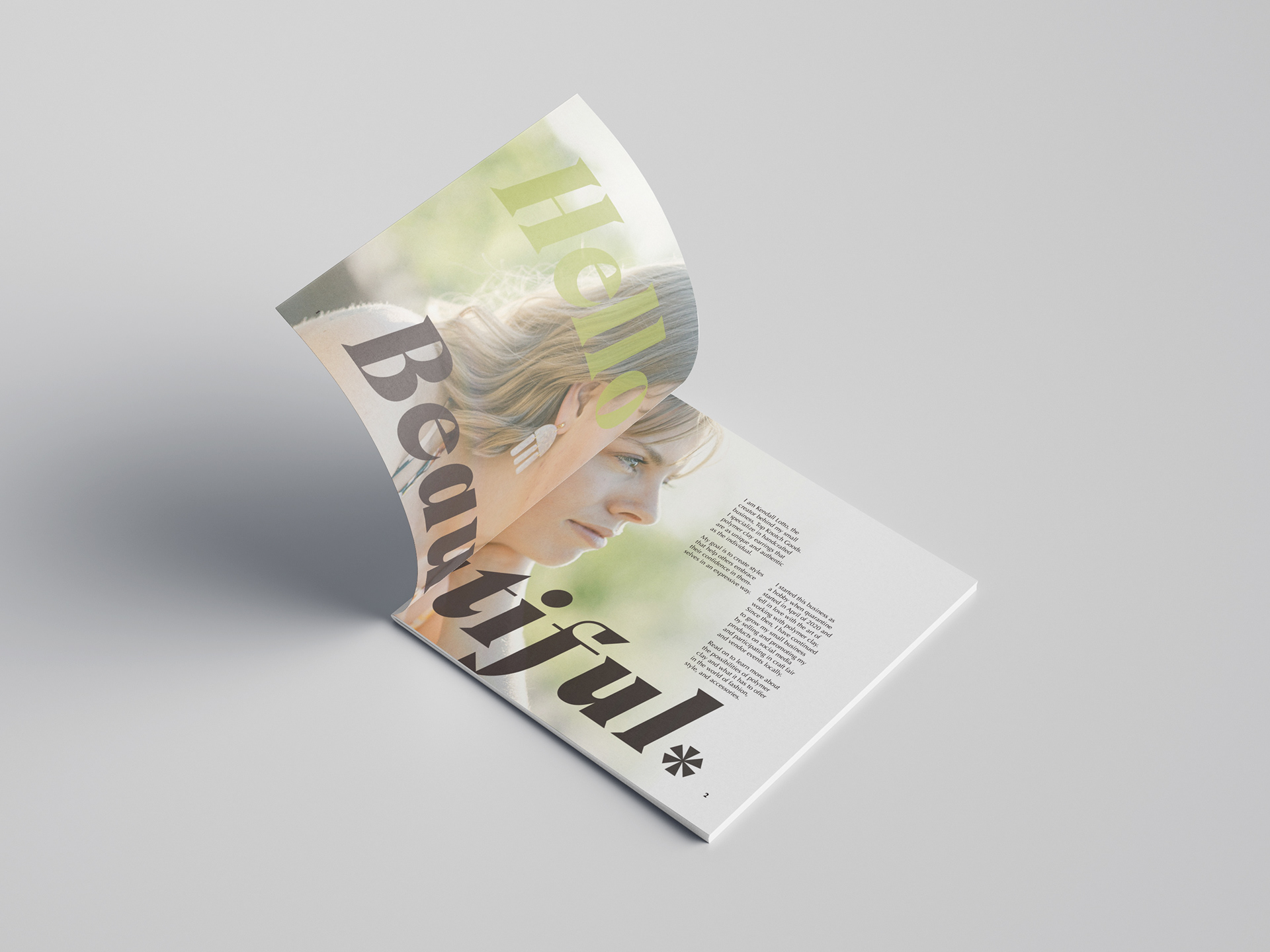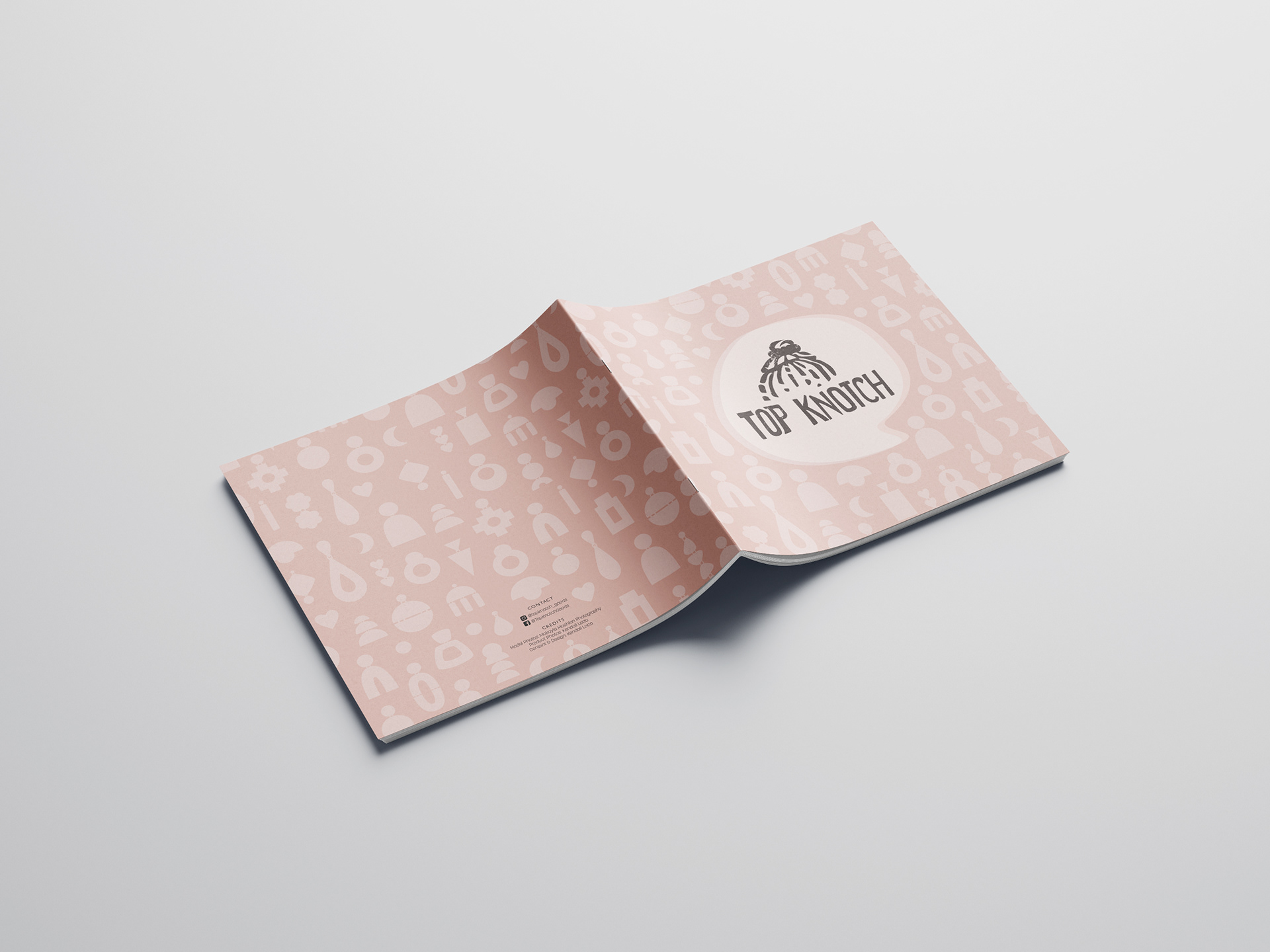
In April of 2020, I started a new hobby in the craft of polymer clay. I created different styles of earrings and decided to make a small business out of it. Since then, I have slowly been growing my small business and have taken on different events at craft fairs and pop-ups in boutiques. To help me spread the word of my business, I created my own business cards. My brand is called Top Knotch Goods. I say the name is a bit of a play-on-words because my signature hairstyle is a top knot and so I created a logo based off my hairstyle. I thought the name was clever since it plays off of 'top notch', which by definition means: of highest quality or excellence. This is a message that I want to send to my audience.


The color palette I chose is very calm and romanticized in color, making it feel playful yet elegant. I also wanted to portray the many different types of earring shapes and options that I have to offer, so I created silhouettes of the shapes to best showcase this. I wanted the back of the card to feel cohesive with the front yet interactive, so I have the shape of a speech bubble with the logo at the bottom as if it were a person speaking to you.

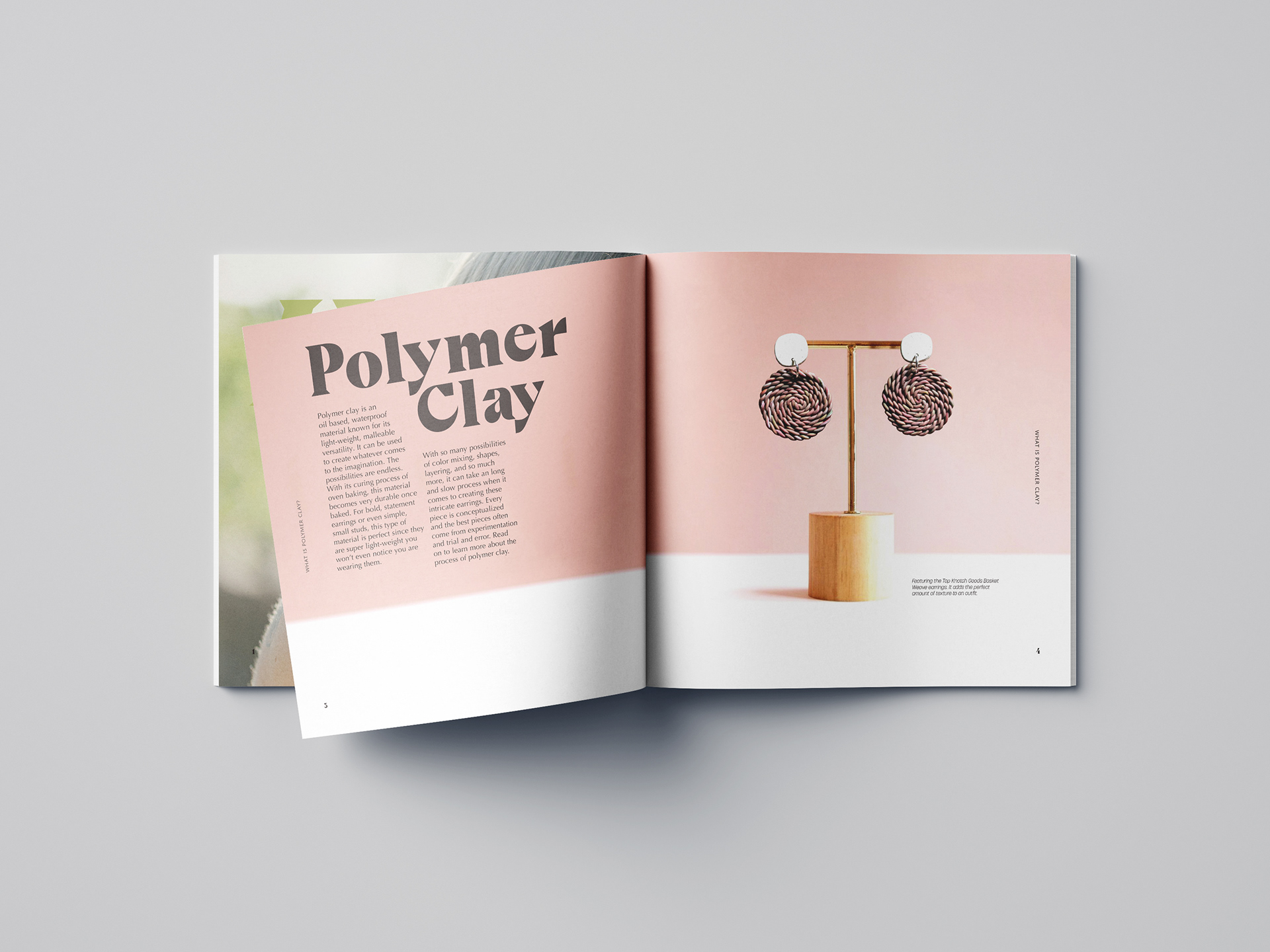
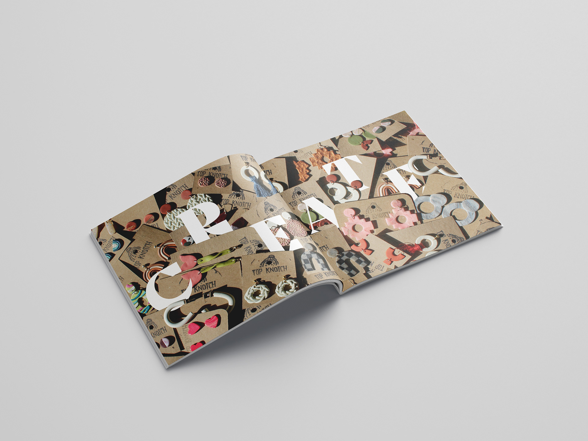
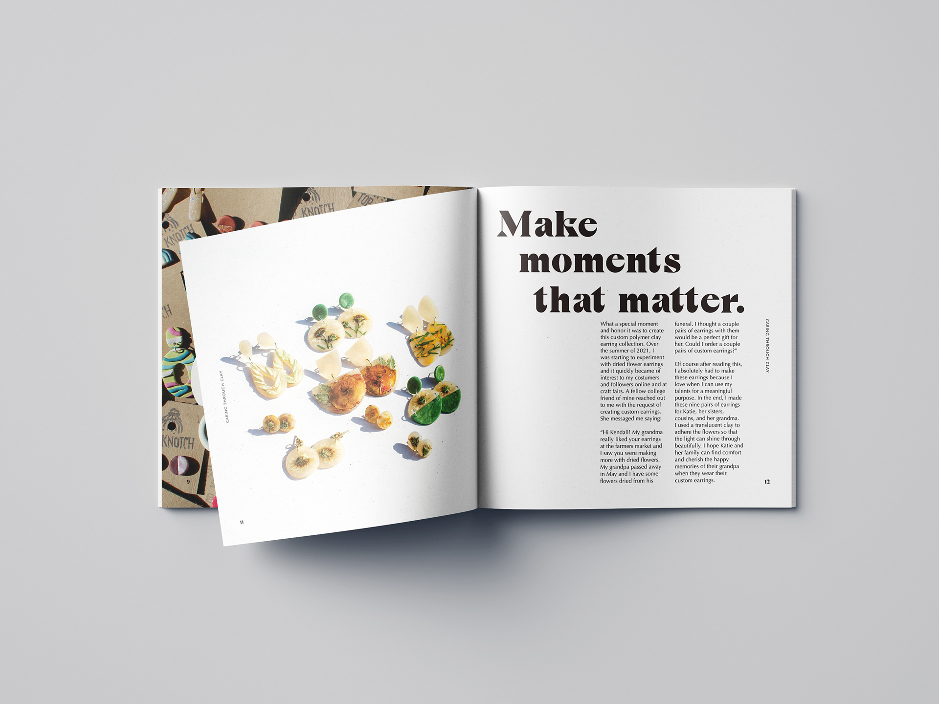
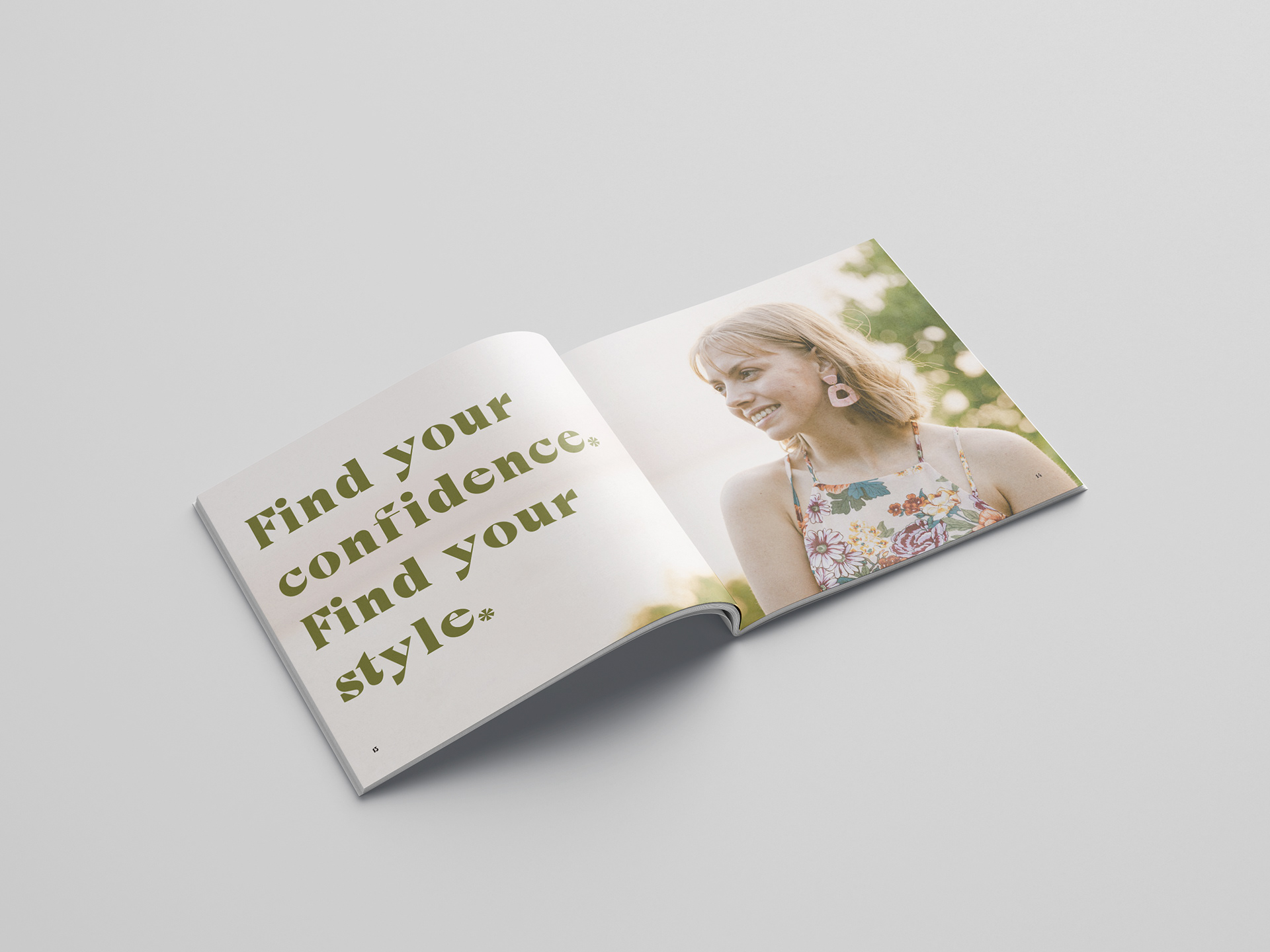
As an exploration project and as a way to benefit my small business, I created and art directed the vision of this 16-page brochure to showcase my work and educate others about the art of polymer clay. This brochure has a consistency in the 11-column grid system, the light pink, orange, and green color scheme, and the fun and playful use of typography.